


Excerpt from "Pop" by Angela Chang, from Taper issue #2
Taper, an online literary journal launched in Spring 2018, publishes computational poems written for the Web. It began at MIT's Trope Tank (directed by Nick Montfort), in exploring how size constraints affect writing. Connecting the experimental writing movement Oulipo's study of constraint systems with the explicit size limits of competitions in the hacker subculture demoscene, Taper asks programmer-poets to construct pieces that fall under a challenging size limit and that address the issue's chosen theme. The wealth of works that function within these constraints include generative, animated, and interactive pieces, some purely verbal or visual, and those playing off existing tropes of computational poetry and pushing at its the boundaries of the medium.
The concept for Taper came from discussions around the book 10 PRINT CHR$(205.5+RND(1)); : GOTO 10 by Montfort et all, leading to the publishing of the Trope Tank's technical report "256 Byte Creative Programs", about writing animations and even text adventure games in this "nano" category. In that report, research affiliate and Taper editor Angela Chang described using the process of developing a tiny program as a pedagogical tool for students.
What I learned, besides some advanced programming tricks for condensing code, is that small programs invite tinkering. Students find these small programs more approachable because there are few variables and operations to think about. They can more easily rearrange lines, change operators to manipulate the constructs (lists, images, and strings) directly than with longer programs.
However, moving this process into a regularly published journal presented other challenges. As editor Sebastian Bartlett, a Computer Science student at MIT, explains, "One particular problem we faced was that of platforms and languages -- some programs in the report were written for the Commodore 64 in BASIC, and others in Python, HTML, and so forth." Asking users to use emulators, or run works in dozens of languages, was not feasible. The answer was to bring it to the Web, asking for works that could play in the browser, across any modern browser in any OS. Since this usually means using JavaScript, a wordy language, the size constraint for the first issue was set at 1k, 4x the size of the 256 byte programs in the initial report.
Authors respond in various ways. One of Bartlett's pieces for issue 1, a minimal labyrinth called "193", shows the influence of demoscene approaches to making the work small enough. It uses every one of the allotted 1k (1024 bytes) in order to make a generated word adventure game, allowing the user to crawl through different spaces, each with a different verb or noun, connected differently in each iteration of the game. His list of transitive verbs is not written as a list of comma-separated strings as it might be normally:
t=["become","transcend","evolve","reawaken","arise","descend","merge","intersect","ignite","condense","radiate","preserve","abandon"];
Instead it appears as:
t="become0transcend0evolve0reawaken0arise0descend0merge0intersect0ignite0condense0radiate0preserve0abandon".split(h=0);
This saves several characters and additionally allows him to declare h and assign it to 0 in the same statement. This JS minimization/obfuscation of JS allows him to include more interactive elements and longer lists of words. He explains how he refined this process, revisiting it in several Taper works.
In "ArcMaze", I use a small random function: "function rn(m,M) {return ~~(Math.random()*(1+M-m))+m;}" In "193", this is shortened to "function r(m){return new Date%m}" This could be further shortened by using an arrow function: "r=r=>new Date%r;". It is fascinating to consider the functional implications of this minification; for instance, using Date will result in identical random numbers if called in short succession, which is why it was ill-suited for "Triangles of Mind".
Bartlett worked in a minified style from the beginning, rather than writing in clear JS and then compacting it, as other programmers might.
Starting from proper JS code causes one to have to keep running the code through a minification script, followed by making incremental edits to improve upon the resulting code, or in some cases removing functionality if refactoring does not suffice. Instead, by writing minified code from the ground-up, I know at all times how much space I have left to add features.
Fellow editor Lillian-Yvonne Bertram took a different approach. An accomplished poet with a PhD in Literature & Creative Writing from the University of Utah, Bertram was a finalist for the 2018 National Poetry Series. She has written codework but describes herself as not having a programming background. Her piece "Weights and Measures" , one of two from issue 1, uses color and animation but no JavaScript at all; the piece is purely HTML and CSS and a small bank of phrases, coming in well under 1k without explicit minimization. Due to the frenetic activity of the piece, it takes some time to read each of the phrases and take in the entirety of the work.
"Weights & Measures" refers to the 3/5 compromise, which in the irrational logic of American chattel slavery, declared that three out of every five slaves would be counted as a person for the purpose of state representation in the House of Representatives. The 3/4 refers to the amount of lbs of cotton in each pound of dollar bills. The intent of the poem is to connect the act of slaves picking cotton that becomes a staple of the currency in a system whose economics of human value render the slave as less than a human.
Judy Heflin, a Master’s student in the Comparative Media Studies department at MIT and editor on issues 2 and 3, says that everything she knows of JS came from working on Taper.
At the time [of issue #2], the size constraint was a nice way to make the task of creating something for the publication seem doable, because it wasn’t allowed to be too large or complex. As I’ve learned more, the constraint now poses an interesting challenge. For these reasons, I think the size constraint is a really great way to make Taper accessible and interesting to people of all skill levels.
 "OHELLOHI ILIEHIDE" by Kavi Duvvoori, from issue 2, "explores the way digital language flickers between being arithmetic data and social communication."
The first issue asked for 1k works on the theme of unity, the second set the size limit at 2k to explore duality, the third 3k with triads as the theme. The themes have pressed the idea that Taper is looking for thoughtful engagement, setting it apart from JS golfing contests that are often spaces to show off ones coding ability or flashy graphics, like JS1k and dwitter -- not to diminish some of the excellent content these sites have generated.
The calls have brought a surprising amount of attention. Editor Angela Chang describes:
It is interesting to see how the community is larger than expected. For many of the artists, this is the only work that they've had ever published, but it's clear that they probably work a lot and don't have stuff online. They are things that coders would use, short-hand techniques. A person in France, it seems they don't actually own their own access to the internet, who presented in issue #2. While others who wrote works are well-known in digital art or poetry, like Ross Goodwin and Milton Läufer.
The open source nature of the journal allows artists to draw from what had been done previously -- nothing in Taper contains outside libraries; each piece is completely self-contained. The changing theme also lets contributors build on their own previous work. Leo Flores wrote works for both issues 2 and 3, based on his Twitter bots, Tiny Protests and Protestitas, about Puerto Rican protests, the originals written using Cheap Bots Done Quick.
I took the code that Milton Läufer had used in Taper #1 for his poem God, or as I like to call it, "The God code." I hacked it for my own purposes, and I made the [Taper version of] Tiny Protests / Protestitas. I worked closely with Angela Chang, both on that one and on Issue #3. She was great. She really helped me compress [my code], so that I wouldn't have these recurrent patterns throughout. But also editorial ... the [issue #3 piece, Juracán] generates situations before, during, and after the hurricane [Maria] hit in the Caribbean and Puerto Rico. So it fit well with the triptych idea. The problem is, how do you represent that in the work? So initially, with my clunky coding, it was just too big, So I sent in three pieces, as a triptych. One before, one during, one after. Angela proposed a way that then I put in a lot of work to implement -- but she helped me on the technical side of it -- doing a much more compressed, much cleaner, more poetically resonant version, that is what is online. And it's only one, there's three columns: one before, one during, one after.
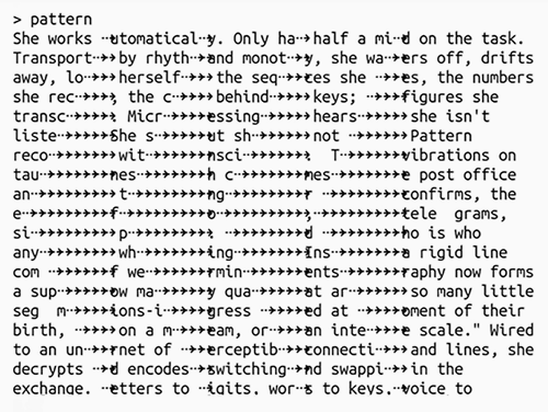
Just as Flores's idea developed from issue 2 to 3, Chang herself revisited her first issue piece, RISE, in each of the following issues. Chang's work engages with beauty of everyday life through her love making bread, and sharing bread as a currency of communication and community. She wrote "RISE" connecting code to yeast. "Here are these burping beasts that we share sugar and water and it puffs up and becomes this beautiful thing. The code is like these small pieces of code, and we edit it and cultivate it and it becomes this experience and isn't it wonderful! And these things are worth noticing." From this, she created "POP" for issue 2 (excerpted at the top of this post), connecting pop culture and the experience of waiting for toast.
I spend a lot of time waiting for toast to pop. Watching a process and getting very focused on the one process. And not really realizing that this fixation is not healthy for us, that we should be cleaning dishes or making better use of our time -- that we like to do, better optimize other things that should happen in your life. Fixating on social media and pop culture. I wrote it in the style of rap battle, one person says one line, the other person says the other line, etc. Trying to constrain the verses to that effect; one person is trying to talk about pop culture, and the other talking about how they're expectantly waiting for this toast to pop and can't wait to eat it.
The obsession with bread continues in issue 3 with "SLICES," a conceptual piece splitting poems on different axes and a meditation on collaboration. 
Excerpt from "Divarication" by Chris Joseph, issue 2, a non-verbal generative poem in under 2k of JavaScript
Flores's "Protestitas" piece reveals more when viewing the source code, through an extended comment, but not in the text of code itself. How much the works in Taper cross into the category of code poetry, where reading the code is essential for full understanding of the piece, is variable across the works. As Bartlett describes: "I like to think of the source-runtime duality as similar to a vinyl LP, where there exists this symbolic flipping of Side A to Side B that must be performed manually in order to see all of the content."
As in poetry, any part of the code both in static source and in dynamic execution can be meaningful, even in non-functional aspects such as the spacing or visual shape of code, the choice of variable names and use of language structures, and so on.
The use of 0 and 1 in my Taper #2 piece, "Thermodynamics", was fully intended as symbolic. The kinds of statements paired with the delimiter choice should, I believe, make light of this symbolic meaning, especially in the context of the [issue 2] Taper Theme of duality (dark and light, yin and yang, past and present, and so forth)... although I can't give definitive answers for other authors' works, I can give examples that I believe could be interpreted symbolically. In Nick [Montfort]'s "US", "pick" has the straightforward programming meaning of picking from an array, but can also evoke imagery of picking between the two sides presented in the piece, in a kind of "us versus them" fashion.
The simple design of Taper and the explicit constraints of the work invite the user to view source, to better understand how the work functions. The visual design is itself minimalistic, inspired by the iconic 1541 disk drive for the Commodore 64. Issue 1's color scheme comes from a 1980s Atari palette, while issues 2 and 3 use the colors of billiard balls as their palette, issue 2 with the yellow "1" ball and blue "2", and 3 adding the red "3" ball, which also suggests a summery strawberry and watermelon theme.
While Taper has begun to receive attention from a larger community, it is still in its early stages. Heflin says:
My favorite response to Taper is always introducing the work to people who can’t believe it exists and are very excited to submit. Before finding the Trope Tank and CMS, I was fumbling around with eccentric computational poetry projects without any real audience or community. I knew I was very excited about what I was making, but I didn’t know who else in the world would ever care about it. It’s always great to be able to introduce Taper to someone who is also very excited about these things, and say, “Here we are! We are your people! Welcome!”
The open call for Issue #4 is posted, with a theme of metaphors, archetypes, perspectives, and paradigm shifts. Rather than expanding to 4k for its size limit, the editors have moved back to 2k, which Chang describes as the sweet spot of tension that forces authors to carefully consider their options while giving them freedom to create.